Monitoring convergence
Nov 20, 2022
Where possible, I like to build systems around convergence.
These systems generally look something like:
- Tick on some regular interval (10 minutes, 1 hour, etc)
- Update the view of the world (discover new data, observe a value, etc)
- Act on the updated view, possibly comparing to the previous view (stop some servers, process newly discovered data, etc)
For example, an auto scaling group would continually check instance health, load, etc, and converge on the desired or optimal number of servers by starting new ones or stopping existing ones.
Monitoring such systems can be a bit different from typical strategies involving throughput, latency, and error rate.
Here are a few methods I like to use.
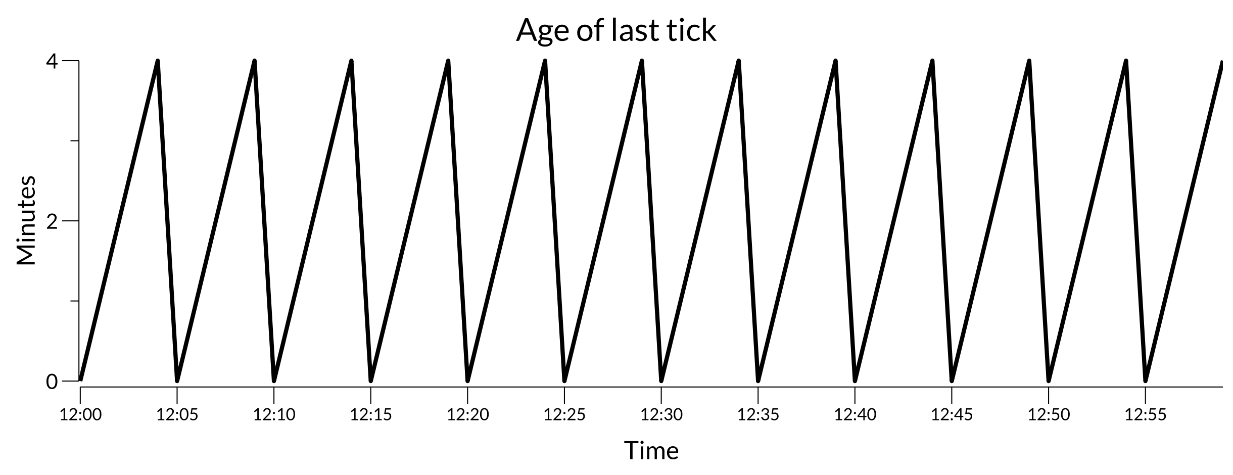
Age of last tick
If a system is meant to tick on a regular interval, an “age of last tick” metric can be useful. Plotting it for a system that ticks every 5 minutes might look like:
Healthy tick plot
This sawtooth pattern shows the system is ticking at the expected frequency and keeping its view of the world fresh.
If there’s trouble with the tick process, such as an error accessing some API or a problem saving the tick results, the plot might change to:
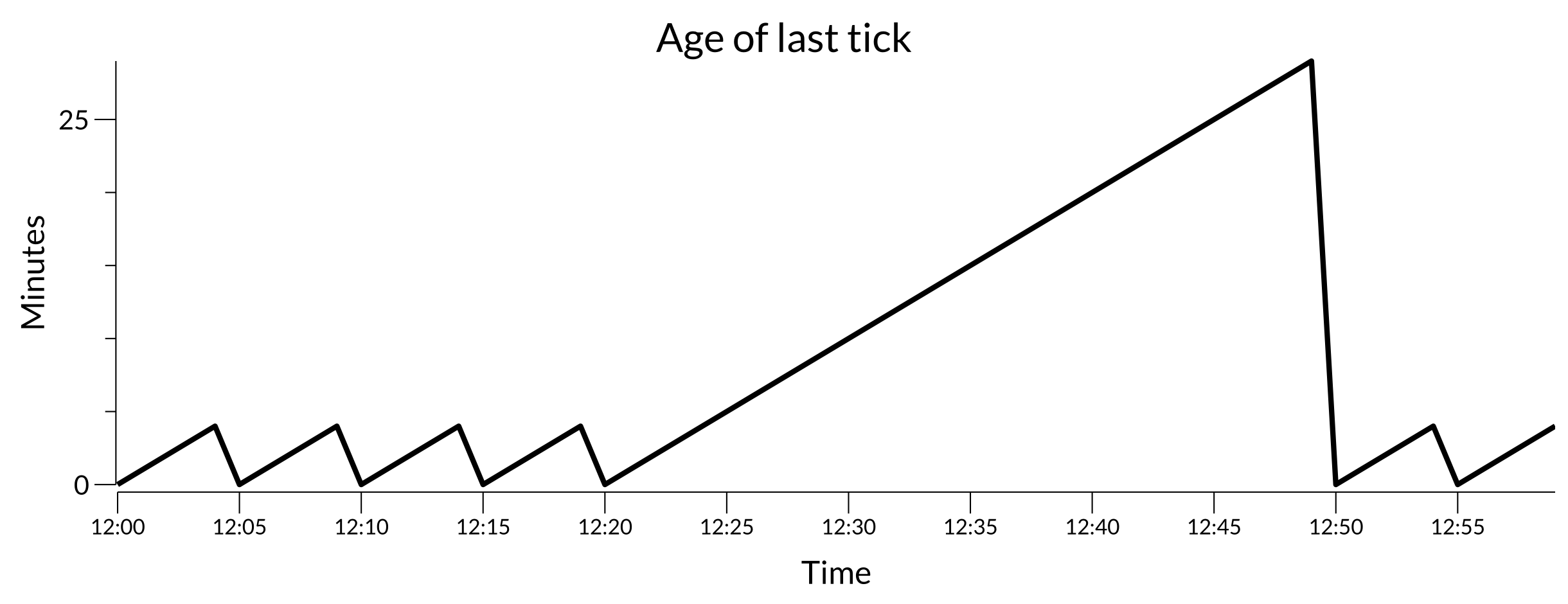
Troubled tick plot
It’s pretty clear by 12:30 that something is amiss and that it recovered around 12:50.
Age of work to be done
It’s common for the tick process to not do all the work but only to discover new work to be done by some other part of the system.
The work to be done might be processing some newly discovered data, starting some servers, etc.
Similar to age of last tick, an “age of work to be done” metric can show when that’s falling behind.
A healthy plot may look like:
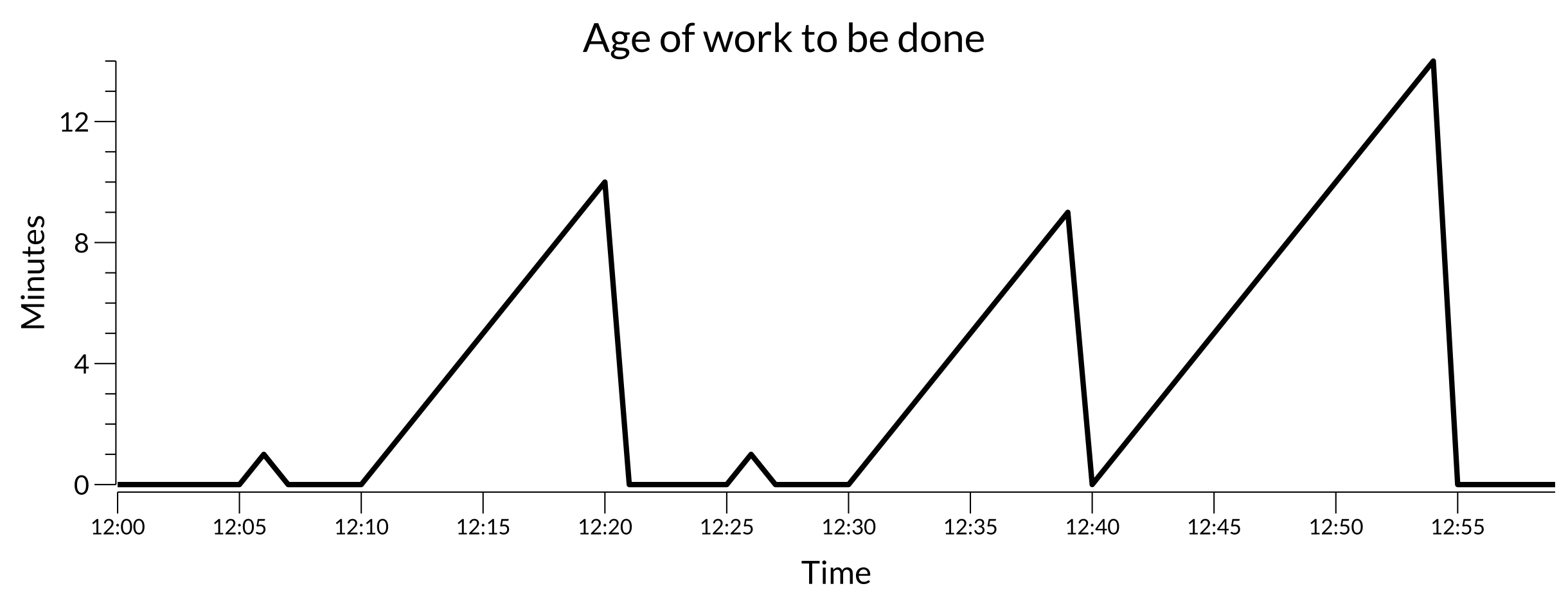
Healthy work plot
Here some work is being discovered by some ticks and processing within 15 minutes or so.
If something goes wrong, the plot may look like:
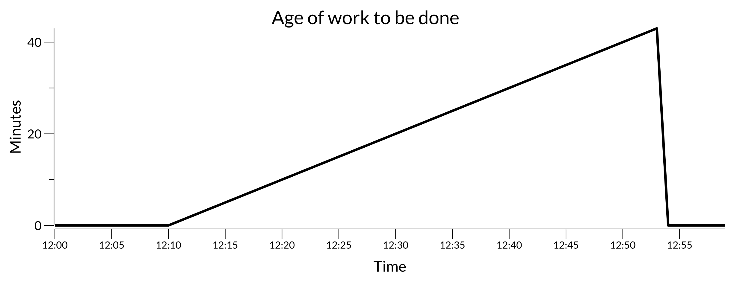
Troubled work plot
Here, some work was discovered at 12:10 and didn’t finish until some time later. Depending on the system, this may indicate there’s trouble keeping up with the discovered work. That could be due to resource contention, encountered errors, or something else.
Worst cases
The system may have 5 sub-systems each doing their own ticking, working, etc.
For both of the above metrics, summarizing the worst case can give a single metric to track.
If it’s possible to emit a metric per sub-system and properly summarize/aggregate those to the worst case in the monitoring stack perhaps that’s good enough. But for some work that can’t be known or named ahead of time it can be helpful for the system itself to summarize locally.
Why I like these
I like these methods since they usually represent a context-independent view of how far off things are. This is especially important when considering systems in aggregate.
For example, if you have 10 systems, each with varying numbers of sub-systems, some are going to be busier than others. Some may be doing nothing at all. But if they have any ticking to do or discovered work to process they should be completing in an acceptable amount of time.